Introduction
The ‘loudness war’ is the tendency of music to be recorded at steadily higher volumes. Essentially sound engineers are trying to make music ‘stand out’ to the human ear by compressing as much sound into their CDs and later MP3 files.
This results in an arms race whereby music from later decades sounds far louder than songs from the 1950s or 1960s.
As a teenager I realised this when I bought Fleetwood Mac’s classic album Rumours. It’s a beautiful album, but I noticed I had to turn up the volume when the likes of The Chain or Dreams came on after other songs in my playlist.
This was the loudness war in action. My later music was much louder than Rumours which came out in 1977.
Spotify
We can see the loudness war visualised through Spotify’s API.
Spotify has a huge database of millions of songs. In its API it has metrics for each song, including loudness, ‘valence’ (a measure of how happy or sad the song sounds), danceability, energy and others.
In this post I’m going to access the Spotify API and get these metrics for every number one in the UK, collected in one handy playlist by the Official Charts Company.
Go to my GitHub link for the full code.
Step 1: Connect to the API
Follow these instructions to connect to the Spotify API through R.
The client ID and client secret token need to be set as environment variables. The link has instructions on how to do this, otherwise it won’t work.
Step 2: Getting the songs in the playlist
The first step is to get the song IDs of all the number ones in the UK, dating back to 1952. The Official Charts Company playlist has about 1,300 different songs in it. Spotify’s API limits you to calling 100 songs from the playlist at a time, so we will define a function to speed things up a bit using the offset argument.
#connect to the API and set these.
Sys.setenv(SPOTIFY_CLIENT_ID = '')
Sys.setenv(SPOTIFY_CLIENT_SECRET = '')

options(scipen = 9999)

library(spotifyr)
library(tidyverse)
library(knitr)

access_token <- get_spotify_access_token()

#get playlist ids
full_playlist <- data.frame()

get_full_playlist <- function(x) {
  playlist <- spotifyr::get_playlist_tracks('5GEf0fJs9xBPr5R4jEQjtw', offset = x)

  #use double <<- to update the data frame out of the loop
  full_playlist <<- rbind(full_playlist, playlist)
}

offset <- seq(0,1400,100)
mapply(get_full_playlist, offset)
Step 3: Song analysis
Spotifyr has a built-in function which provides song features such as loudness, valence and danceability as a handy data frame. We can use mapply to apply the function to all the song IDs we got from the playlist.
Afterwards there is a bit of tidying up to do to the data frame.
#get song analysis

analysis <- mapply(full_playlist$track.id, FUN = get_track_audio_features)
analysis_df <- as.data.frame(t(analysis))

#remove lists within df
analysis_df <- lapply(analysis_df, as.character) %>% as.data.frame(stringsAsFactors = FALSE)

#make numeric cols numeric
analysis_df[,1:11] <- lapply(analysis_df[,1:11], as.numeric)
analysis_df[,17:18] <- lapply(analysis_df[,17:18], as.numeric)
Step 4: Adding the song names
It’s a good idea at this point to add the song names because the analysis_df only has the song ids. We can merge them from our earlier full_playlist data frame.
The original call to get all the song IDs got the number ones in chronological order. Using the merge function will mess up the sequence so it’s important we take steps to preserve it.
#add names of songs while keeping the positions of songs
analysis_df$position <- row.names(analysis_df) %>% as.numeric()
full_playlist_df <- data.frame(id = full_playlist$track.id, name = full_playlist$track.name)
analysis_df <- merge(analysis_df, full_playlist_df, by = 'id')
analysis_df <- arrange(analysis_df, position)

#reverse order
analysis_df <- analysis_df %>% map_df(rev)
Step 5: Add the decades
We can cross reference the song names with Wikipedia to identify which decade they were released. This is much easier to do with names than with ids.
#add decades
analysis_df$decade <- NA
analysis_df$decade[1:95] <- '1950s'
analysis_df$decade[96:280] <- '1960s'
analysis_df$decade[281:442] <- '1970s'
analysis_df$decade[443:624] <- '1980s'
analysis_df$decade[625:818] <- '1990s'
analysis_df$decade[819:1087] <- '2000s'
analysis_df$decade[1088:1327] <- '2010s'

analysis_df$decade <- as.factor(analysis_df$decade)
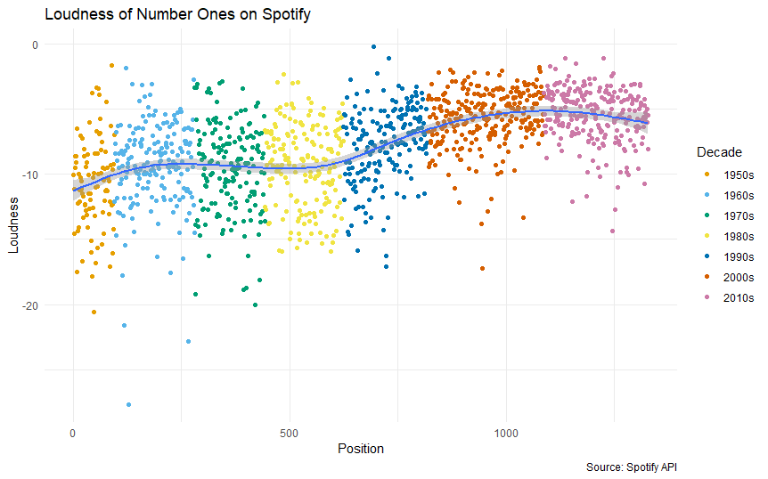
Step 6: Plot
#add colours
cbp1 <- c("#E69F00", "#56B4E9", "#009E73",
          "#F0E442", "#0072B2", "#D55E00", "#CC79A7")

#plot

ggplot(analysis_df, aes(as.numeric(row.names(analysis_df)), loudness)) +
  geom_point(aes(colour = decade)) +
  geom_smooth() + theme_minimal() + scale_colour_manual(values = cbp1) + labs(title = 'Loudness of Number Ones on Spotify',x = 'Position',y = 'Loudness',caption = 'Source: Spotify API', colour = 'Decade')

ggplot(analysis_df, aes(as.numeric(row.names(analysis_df)), valence)) +
  geom_point(aes(colour = decade)) +
  geom_smooth() + theme_minimal() + scale_colour_manual(values = cbp1) + labs(title = 'Positivity of Number Ones on Spotify',x = 'Position',y = 'Valence (1 = very happy)',caption = 'Source: Spotify API', colour = 'Decade')

ggplot(analysis_df, aes(as.numeric(row.names(analysis_df)), danceability)) +
  geom_point(aes(colour = decade)) +
  geom_smooth() + theme_minimal() + scale_colour_manual(values = cbp1) + labs(title = 'Danceability of Number Ones on Spotify',x = 'Position',y = 'Danceability',caption = 'Source: Spotify API', colour = 'Decade')


Discussion
We can see from the plot that there is a notable increase in loudness of UK number ones from the 1950s to the late 2010s, although it appears to have cooled somewhat in the last few years.
If we had access to all the original versions the trend would likely be more pronounced still. Some of the early number ones such as hits from the Beatles are available on Spotify as remastered versions, which will likely artificially increase their volume compared to what listeners would have heard on the radio or on their vinyl players.
A few years ago Spotify reportedly quietened down some of the louder tracks on its service, but evidence of the arms race remains.
A depressing decade?
From the valence chart we can see number ones have generally become more downbeat since a peak in the Sixties and some rises in the 1970s and 2000s.
Some of the most cheerful number ones include Return to Sender by Elvis Presley, Can’t Get You out of My Head by Kylie Minogue and, unsurprisingly, Happy by Pharrell Williams.
On the other hand, some of the gloomiest number ones according to Spotify’s API are My Heart Will Go On by Celine Dion and Alexandra Burke’s version of Hallelujah.
Get on your dancing shoes
Number ones in the UK have been getting steadily more ‘danceable’ since the charts have been going.
Spotify defines ‘danceability’ as:
Danceability describes how suitable a track is for dancing based on a combination of musical elements including tempo, rhythm stability, beat strength, and overall regularity.
Some of the most danceable number ones are definitely floor-fillers, including Ice Ice Baby (officially the most danceable number one of all time), Put Your Hands Up for Detroit and Shaggy’s classic It Wasn’t Me.
Conclusion: a loss of originality?
When I first ran this analysis I thought that number ones would be getting steadily happier according to Spotify’s valence index. In fact it seems to move in cycles, with periods of more cheerful ones interspersed with more depressing ones.
However songs are becoming louder and more ‘danceable’ – in other words, more regular.
Does that mean hits are losing their originality?
It’s easy to dismiss the ‘modern music is boring’ argument as something that is echoed by every generation as it gets older.
But in 2012 Spanish researchers arrived at a similar conclusion. According to Reuters:
“We found evidence of a progressive homogenization of the musical discourse,” Serra told Reuters. “In particular, we obtained numerical indicators that the diversity of transitions between note combinations – roughly speaking chords plus melodies – has consistently diminished in the last 50 years.”
If we use danceability as a proxy for regularity of music, then my analysis supports this theory. Hip music gurus may have a point after all.