I did a post on Twitter in November about how to analyse users’ Twitter followers. We looked at whether Arsenal and Tottenham Hotspur footballers, rivals on the pitch, were followers on social media.
Here is another peek at the plot:

What we haven’t done so far is use the Twitter API to analyse tweets sent on the platform. We’ll do that in this post on the festive topic of Christmas. Additionally we’ll delve into sentiment analysis to weigh up whether people are feeling positive about the season or whether they are channelling their inner Scrooge.
Full code:
library(tidyverse)
library(tidytext)
library(rtweet)

#login
create_token(
app = "your_app",
consumer_key = "###",
consumer_secret = "###",
access_token = "###",
access_secret = "###")

#tweet analysis

search_term <- '#ChristmasEveEve'
by <- 'hour'


tweets <- search_tweets(
search_term, n = 10000, retryonratelimit = TRUE
)


tweets$date <- substr(tweets$created_at,1,10)
tweets <- tweets[tweets$date == '2019-12-23',]


rtweet::ts_plot(tweets, by = by, trim = 1) + geom_point() + theme_minimal() + labs(title = paste0('Tweets mentioning "',search_term,'" by ',by),
x = 'Date', y = 'Count', caption = 'Source: Twitter API')


#save
ggsave('tweet_volume.png',last_plot())

#sentiment
sentiment <- tweets[,3:5] %>% unnest_tokens(output = 'word', input = 'text')

#add sentiment dataset
sentiment_dataset <- get_sentiments("afinn")
sentiment_dataset <- arrange(sentiment_dataset, -value)

#merge
sentiment <- merge(sentiment, sentiment_dataset, by = 'word')

#clean
sentiment$word <- NULL
sentiment$screen_name <- NULL

#time
sentiment$hour <- format(round(sentiment$created_at, units="hours"), format="%H:%M")

#pivot
pivot <- sentiment %>%
group_by(hour) %>%
summarise(sentiment = mean(value))

#plot
ggplot(pivot[-1,], aes(x = hour, y = sentiment)) + geom_line(group = 1) + geom_point() + theme_minimal() + labs(title = paste0('Average sentiment of tweetings mentioning "',search_term,'"'),
subtitle = paste0(pivot$hour[2],' - ',pivot$hour[nrow(pivot)],' on ', format(sentiment$created_at[1], '%d %B %Y')),
x = 'Date', y = 'Sentiment', caption = 'Source: Twitter API')
ggsave('tweet_sentiment.png',last_plot(), width = 8, height = 6)
Step 1: Authenticate and log in to the Twitter API
As in the last post that used the Twitter API, you’ll need to create an app and authorise it if you haven’t already. Here is the documentation for how to do this, or you can read my previous post. Remember not to share you keys with anyone, unless you trust that person with your account!
library(tidyverse)
library(tidytext)
library(rtweet)

create_token(
  app = "your_app_name",
  consumer_key = "###",
  consumer_secret = "###",
  access_token = "###",
  access_secret = "###")
Step 2: Gather some tweets
As it’s nearly Christmas, I thought I’d gather some festive tweets for this post. At the time of writing it is 23 December, otherwise known as ‘Christmas Eve Eve’. We’ll choose that.
I set a by variable as hour for the plot that will come later. I’m also filtering out tweets sent before Christmas Eve Eve. Otherwise you get a plot that looks like this:

Tweets about 23 December shoot up in volume on 23 December! Groundbreaking analysis that is not.
search_term <- '#ChristmasEveEve'
by <- 'hour'

tweets <- search_tweets(
search_term, n = 10000, retryonratelimit = TRUE
)

tweets$date <- substr(tweets$created_at,1,10)
tweets <- tweets[tweets$date == '2019-12-23',]
Step 3: Plot a chart of tweets by volume
The rtweet package that we are using contains a function called ts_plot. It uses ggplot to build a line chart of tweets over time. You can call by as an argument to specify days, hours or minutes, which is very useful for searches with differing volumes of tweets. In this case we have already set by to hour. The trim argument removes the first
rtweet::ts_plot(tweets, by = by, trim = 1) + geom_point() +
theme_minimal() + labs(title = paste0('Tweets mentioning "',
search_term,'" by ',by),
x = 'Date', y = 'Count', caption = 'Source: Twitter API')


#save
ggsave('tweet_volume.png',last_plot())

That is looking much better.
Step 4: Sentiment analysis
Sentiment analysis is the science of measuring the positivity or negativity of words. The aim is to get an overall sense of the tone of some text by analysing the connotations of the words that make it up. The tidytext package has several dictionaries of words scored by their positive or negative connotations. Comparing each individual word against the lexicon allows us to build up a rough picture of whether the statements are positive or negative in tone.
Here is an example, from the lexicon we’ll be using:
sentiment_dataset <- get_sentiments("afinn")
sentiment_dataset <- arrange(sentiment_dataset, value)
> sentiment_dataset[1:10,]
# A tibble: 10 x 2
word value
<chr> <dbl>
1 breathtaking 5
2 hurrah 5
3 outstanding 5
4 superb 5
5 thrilled 5
6 amazing 4
7 awesome 4
8 brilliant 4
9 ecstatic 4
10 euphoric 4
These positive words are given scores of four or five. Negative words like ‘hatred’, ‘poison’ or ‘terrible’ are given negative scores of up to minus five.
This is just one way to measure sentiment – there are other classifications you can use instead.
The first step is to split the tweets up into individual words:
sentiment <- tweets[,3:5] %>% unnest_tokens(output = 'word', input = 'text')
Step 5: Merge the Twitter data with the sentiment scores
This gives us a data frame of each word in each tweet as a new row. Now we will merge it with the lexicon. It will remove any words that don’t match the database, which will include any hashtags, @ handles and any other missing words.
After a bit more cleaning we are almost ready to plot.
sentiment_dataset <- get_sentiments("afinn")
sentiment_dataset <- arrange(sentiment_dataset, -value)

#merge
sentiment <- merge(sentiment, sentiment_dataset, by = 'word')

#clean
sentiment$word <- NULL
sentiment$screen_name <- NULL

#get nearest hour of time for plot
sentiment$hour <- format(round(sentiment$created_at, units="hours"), format="%H:%M")
Step 6: Pivot and plot
In the previous step we rounded the timestamp of each tweet to the nearest hour. The data frame looked like this:
> str(sentiment)

'data.frame': 16280 obs. of  3 variables:
 $ created_at: POSIXct, format: "2019-12-23 16:30:59" "2019-12-23 15:21:00" "2019-12-23 14:28:16" "2019-12-23 15:14:28" ...
 $ value     : num  -2 2 1 -3 -3 -3 -3 -2 -2 1 ...
 $ hour      : chr  "17:00" "15:00" "14:00" "15:00" ...
Each record has its sentiment value, a timestamp and the nearest hour. We no longer need the word or who originally tweeted it because they are no longer relevant.
The final step before plotting is to summarise the data frame into a table with the mean net sentiment score for each hour. Initially I summed the sentiment values together for each hour but then I found that it tallied closely with the volume of tweets, which made it of little use.
pivot <- sentiment %>%
group_by(hour) %>%
summarise(sentiment = mean(value))

#plot
ggplot(pivot[-1,], aes(x = hour, y = sentiment)) + geom_line(group = 1) + geom_point() + theme_minimal() + labs(title = paste0('Average sentiment of tweetings mentioning "',search_term,'"'),
subtitle = paste0(pivot$hour[2],' - ',pivot$hour[nrow(pivot)],' on ', format(sentiment$created_at[1], '%d %B %Y')),
x = 'Date', y = 'Sentiment', caption = 'Source: Twitter API')

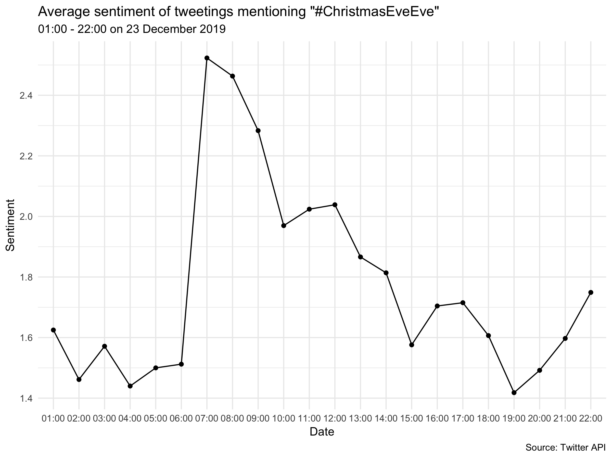
Analysis
We can see that sentiment peaked sharply around 07:00 as people began to realise Christmas was the day after next. The rest of the day it steadily fell away with occasional slight rebounds.
Conclusion
Sentiment analysis is an inexact but useful science. Inevitably the analysis takes words out of context and interprets them at face value. Irony, sarcasm and quotations are beyond the scope of this type of project and are extremely difficult to factor into any machine-led textual analysis.
However, with these caveats in mind you can still derive value from sentiment analysis if you have a rich and large corpus. The best I’ve seen is Julia Silge’s wonderful work on sentiment in Jane Austen’s novels. If nothing else, you can prove, using R, that it really is the most wonderful time of year.
On that note, have a happy Christmas.