One of the most popular releases by the UK Office for National Statistics (ONS) is the annual register of the most popular baby names for boys and girls in England and Wales.
The most popular baby names in the United States is actually bundled up in a R package by Hadley Wickham, simply called babynames.
This means we can compare the two to see which names are more popular in England and Wales with the US, and vice versa. I’d expect there to be a certain amount of crossover but it will be interesting to see which names feature on which side of the pond.
Here is the full code:
library(tidyverse)
library(babynames)

#US data
us <- data.frame(babynames[babynames$year == '2017',])

us_boys <- us[us$sex == 'M',]
us_girls <- us[us$sex == 'F',]

us_boys$rank <- rank(-us_boys$n, ties.method = 'random')
us_girls$rank <- rank(-us_girls$n, ties.method = 'random')

us_boys_50 <- us_boys[us_boys$rank <= 50,]
us_girls_50 <- us_girls[us_girls$rank <= 50,]

#download the England and Wales data and put them in your_directory as CSVs
setwd('your_directory')

#UK data
uk_boys <- read_csv('boysuk.csv')
uk_boys_50 <- uk_boys[uk_boys$Rank <= 50,]

uk_girls <- read_csv('girlsuk.csv')
uk_girls_50 <- uk_girls[uk_girls$Rank <= 50,]

#Make the names Proper rather than ALL CAPS
uk_boys_50$Name <- str_to_title(uk_boys_50$Name)
uk_girls_50$Name <- str_to_title(uk_girls_50$Name)

#merge the two
uk_us_girls <- merge(uk_girls_50, us_girls_50, by.x = 'Name', by.y = 'name', all = TRUE)
uk_us_boys <- merge(uk_boys_50, us_boys_50, by.x = 'Name', by.y = 'name', all = TRUE)

uk_us_girls$diff <- uk_us_girls$Rank - uk_us_girls$rank
uk_us_boys$diff <- uk_us_boys$Rank - uk_us_boys$rank

uk_us_girls <- arrange(uk_us_girls, Rank)
uk_us_boys <- arrange(uk_us_boys, Rank)

#start the comparisons
boys <- data.frame(name = uk_us_boys$Name, `England and Wales` = uk_us_boys$Rank, `United States` = uk_us_boys$rank)
girls <- data.frame(name = uk_us_girls$Name, `England and Wales` = uk_us_girls$Rank, `United States` = uk_us_girls$rank)

boys <- gather(boys, key = 'country', value = 'value', -name)
boys$gender <- 'Boys'

girls <- gather(girls, key = 'country', value = 'value', -name)
girls$gender <- 'Girls'

#merge the genders together
comparison <- rbind(boys, girls)
comparison$country <- gsub('England.and.Wales','England and Wales',comparison$country)
comparison$hjust <- ifelse(comparison$country == 'England and Wales', yes = 'right', no = 'left')
comparison$nudge <- ifelse(comparison$country == 'England and Wales', yes = -0.03, no = 0.03)

#plot
ggplot(comparison, aes(y = value, x = country, group = name)) + geom_point(size = 2, alpha = 0.8, aes(color = gender)) +
geom_line(aes(color = gender)) +
theme_minimal() +
geom_text(size = 7, aes(label = name, hjust = comparison$hjust), nudge_x = comparison$nudge) +
facet_grid(cols = vars(gender)) +
scale_y_reverse(min = 1, breaks = c(1,seq(5,50,5)), labels = c(1,seq(5,50,5))) +
theme(legend.position = 'none',
axis.text = element_text(size = 18),
axis.title = element_blank(),
strip.text = element_text(size = 24),
plot.title = element_text(size = 32),
plot.subtitle = element_text(size = 24),
plot.caption = element_text(size = 14)) +
labs(title = 'Comparing the most popular British baby names with their American counterparts',
subtitle = 'This chart takes the top 50 most popular names for boys and girls in England and Wales for 2018 and compares them with the US data for 2017.\nIf there is no line, then that name was not in the top 50 in the US.',
y = 'Rank', caption = 'Sources: Office for National Statistics, Social Security Association')

ggsave('babycomparison.png',last_plot(), height = 19, width = 21)
Step 1:
Install the babynames package if you need to and load it with the tidyverse package for analysis and our eventual plot using ggplot.
Step 2:
#US data us <- data.frame(babynames[babynames$year == '2017',])
us_boys <- us[us$sex == 'M',]
us_girls <- us[us$sex == 'F',]

us_boys$rank <- rank(-us_boys$n, ties.method = 'random')
us_girls$rank <- rank(-us_girls$n, ties.method = 'random')

us_boys_50 <- us_boys[us_boys$rank <= 50,]
us_girls_50 <- us_girls[us_girls$rank <= 50,]
Next up is to prepare the US data. Calling babynames automatically brings up the data frame of historical baby names data going back to 1880, so we can filter it straight away just to get the latest data (2017 at the time of writing).
Then we can separate it out into boys and girls using the sex dimension. The package doesn’t actually have the ranks included so we are going to rank them ourselves. There are a few ways you can break ties using the rank function (for example if there is a joint second place).
For our purposes though we don’t want any equal ranks because it will mess up our plot, so we will let the computer decide by setting ties.method to random.
Finally we will filter it down to the top 50 for each sex.
Step 3:
#download the England and Wales data and put them in your_directory as CSVs
setwd('your_directory')
#UK data
uk_boys <- read_csv('boysuk.csv')
uk_boys_50 <- uk_boys[uk_boys$Rank <= 50,]

uk_girls <- read_csv('girlsuk.csv')
uk_girls_50 <- uk_girls[uk_girls$Rank <= 50,]

#Make the names Proper rather than ALL CAPS
uk_boys_50$Name <- str_to_title(uk_boys_50$Name)
uk_girls_50$Name <- str_to_title(uk_girls_50$Name)
Now we will do the same for the England and Wales data. We can download it here for girls from the ONS website and here for boys.
Use table 6 in the 2018 spreadsheets and save these as CSVs in your working directory. Then we will run similar functions to prepare the England and Wales data.
Step 4:
#merge the two
uk_us_girls <- merge(uk_girls_50, us_girls_50,
by.x = 'Name', by.y = 'name', all = TRUE)
uk_us_boys <- merge(uk_boys_50, us_boys_50,
by.x = 'Name', by.y = 'name', all = TRUE)

uk_us_girls$diff <- uk_us_girls$Rank - uk_us_girls$rank
uk_us_boys$diff <- uk_us_boys$Rank - uk_us_boys$rank

uk_us_girls <- arrange(uk_us_girls, Rank)
uk_us_boys <- arrange(uk_us_boys, Rank)
Next up we begin the comparison by merging the two countries into two data frames for boys and girls. We are using the all = TRUE argument because we want the cases where a name exists in one top 50 but not the other.
The type of chart we will be using is a slope chart. These are very good at showing how values have changed from point to point (usually time as the variable, but geography in this case).
To calculate the slope for each name we need to subtract the American rank from the England and Wales rank. This diff dimension will calculate the angle of the slope in the plot.
Step 5:
#start the comparisons
boys <- data.frame(name = uk_us_boys$Name,
`England and Wales` = uk_us_boys$Rank, `United States` = uk_us_boys$rank)
girls <- data.frame(name = uk_us_girls$Name,
`England and Wales` = uk_us_girls$Rank, `United States` = uk_us_girls$rank)

boys <- gather(boys, key = 'country', value = 'value', -name)
boys$gender <- 'Boys'

girls <- gather(girls, key = 'country', value = 'value', -name)
girls$gender <- 'Girls'
Next it’s time to isolate just the names and the two rankings for boys and girls. The American and British rankings are in different columns, marked as ‘England.and.Wales’ and ‘United.States’ in the column names. To make the slope chart work we need to turn this data into vertical data, introducing these column names as variables. We can do this using the gather function.
Using the -name argument keeps the names where they are. We will do that for both sexes and include a gender dimension so we know which sex they are.
Step 6:
#merge the genders together
comparison <- rbind(boys, girls)
comparison$country <- gsub('England.and.Wales','England and Wales',comparison$country)
comparison$hjust <- ifelse(comparison$country == 'England and Wales', yes = 'right', no = 'left')
comparison$nudge <- ifelse(comparison$country == 'England and Wales', yes = -0.03, no = 0.03)
Now we can use rbind to join the two data frames together. We will be using ggplot to plot the data.
The hjust and nudge dimensions are for the text plotting that we will do later. The names will appear as points on the slope chart, which is really just a modified line plot. We need the geom_text function to show which name is which, otherwise the plot will be 200 meaningless points. The hjust and vjust arguments in geom_text are used to shift labels up and down (vjust) and side to side (hjust). The nudge_x and nudge_y arguments are for fine-tuning, in this case so that are labels do not appear on top of the points.
We are setting these now so that the American and British labels will appear neatly on opposite sides.
Step 7:
#plot
ggplot(comparison, aes(y = value, x = country, group = name)) + geom_point(size = 2, alpha = 0.8, aes(color = gender)) +
geom_line(aes(color = gender)) +
theme_minimal() +
geom_text(size = 7, aes(label = name, hjust = comparison$hjust), nudge_x = comparison$nudge) +
facet_grid(cols = vars(gender)) +
scale_y_reverse(min = 1, breaks = c(1,seq(5,50,5)), labels = c(1,seq(5,50,5))) +
theme(legend.position = 'none',
axis.text = element_text(size = 18),
axis.title = element_blank(),
strip.text = element_text(size = 24),
plot.title = element_text(size = 32),
plot.subtitle = element_text(size = 24),
plot.caption = element_text(size = 14)) +
labs(title = 'Comparing the most popular British baby names with their American counterparts',
subtitle = 'This chart takes the top 50 most popular names for boys and girls in England and Wales for 2018 and compares them with the US data for 2017.\nIf there is no line, then that name was not in the top 50 in the US.',
y = 'Rank', caption = 'Sources: Office for National Statistics, Social Security Association')

ggsave('babycomparison.png',last_plot(), height = 19, width = 21)
The final part is the plot! It’s quite a complicated one. This plot conveys a lot of information so it’s important to fine-tune it so that we can achieve a balance of telling the story without cramming the plot too full of data.
I am using the facet_grid function to separate the plot into two by gender.
It’s best viewed in a PNG which we can generate using the ggsave function.
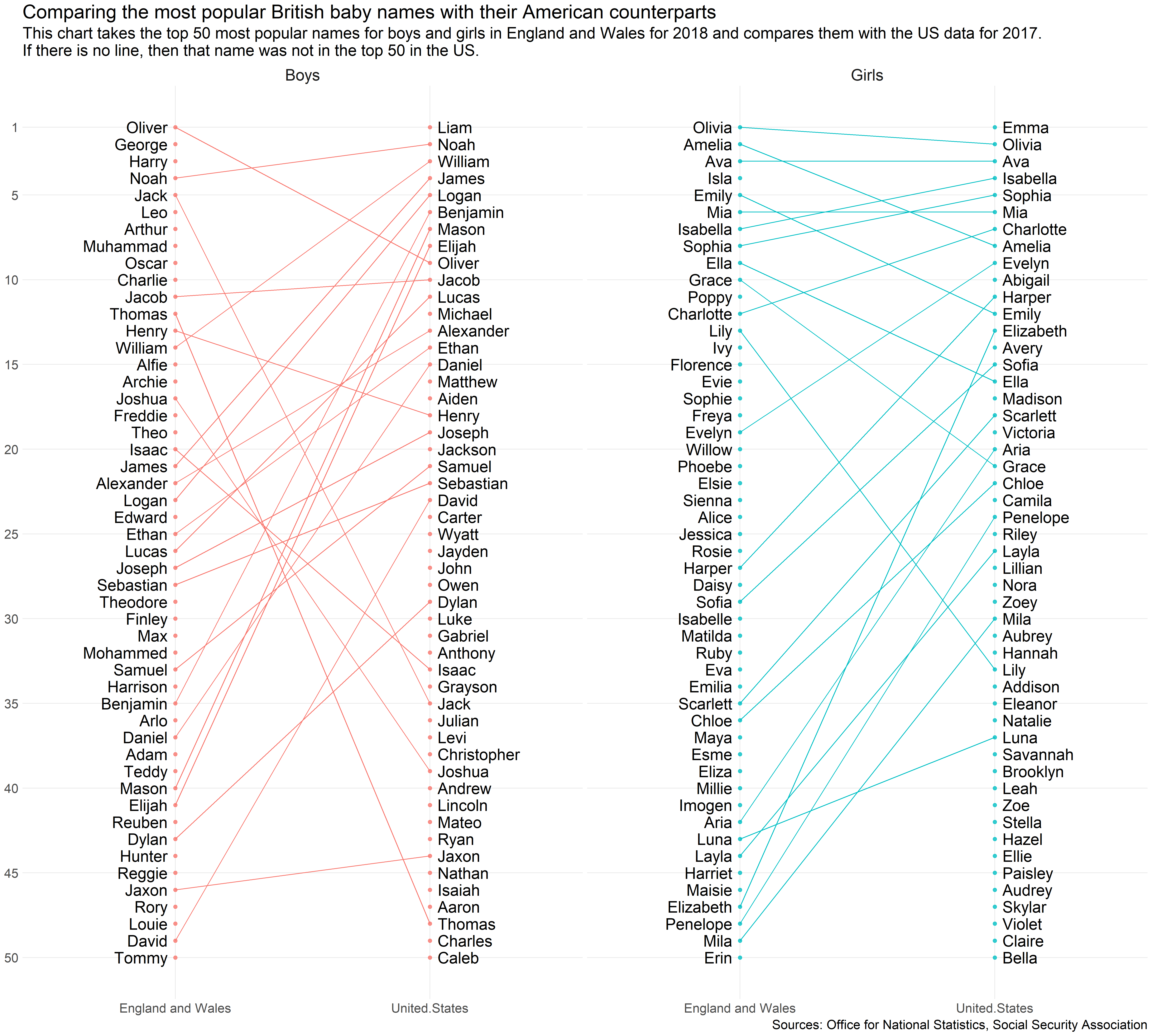
Analysis
Liam and Emma, the most popular baby names for boys and girls respectively in the US, don’t feature in the England and Wales top 50 at all.
Noah and Ava, on the other hand, are consistently very popular on both sides of the Atlantic. Ava is the third most popular girl’s name for both, while Noah is in second place in the US and fourth in England and Wales.
We can see that there is more consistency at the top for girls than boys. Nine of the top 10 most popular names for baby girls in England and Wales feature in the American top 50, with only Isla missing out. On the other hand only Oliver, Noah and Jack feature in the England and Wales top 10 and the American top 50.
Conclusion
Slope charts are very useful for plotting how something has changed, usually over time. With ggplot it’s quite simple to create stylish slope charts like the one I’ve just shown you.