Author’s note: if you like this post, you might like Landmark Atlas. This is my new blog where I tell stories about Britain’s history, culture and geography through maps.
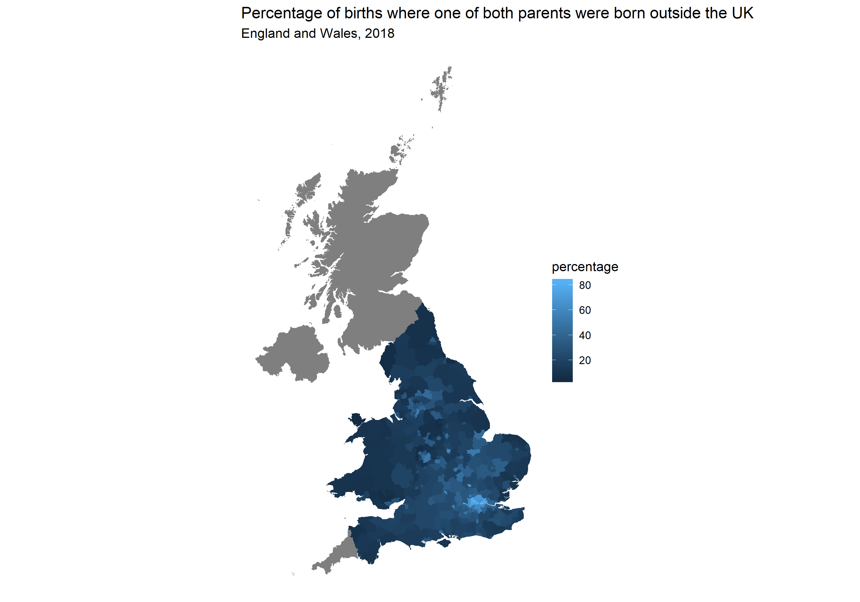
This post is a simple demonstration of how to make choropleth maps like the one here using local authorities in England and Wales.
Choropleth maps present a map of territories coloured in according to a variable. These can be countries, counties, districts or more detailed neighbourhood data. They are very useful to show how something newsworthy, such as poverty, crime or homelessness, varies around a city, country or the world.
Here is the full code:
library(tidyverse)
library(rgeos)
library(rgdal)
library(maptools)


setwd('YOUR_DIRECTORY')
shp <- readOGR('Local_Authority_Districts_April_2019_Boundaries_UK_BUC.shp')
shp <- fortify(shp, region = 'lad19cd')

setwd('OTHER_DIRECTORY')
live_births <- read_csv('parentscountryofbirth - Sheet1.csv')

shp <- merge(shp, live_births, by.x = 'id', by.y = 'code', all.x = TRUE)
shp <- arrange(shp, order)

p <- ggplot(data = shp, aes(x = long, y = lat, group = group, fill = percentage)) +
  geom_polygon() + coord_equal() + theme_void() +
  ggtitle('Percentage of births where one of both parents were born outside the UK',
          subtitle = 'England and Wales, 2018')

p
We’ll go through it step by step:
Step 1:
Load the two packages we need, in this order.
#use install.packages to install if necessary
library(tidyverse)
library(rgeos)
library(rgdal)
library(maptools)
Step 2:
Next, we need the local authority boundaries that will form the outlines of our map. They are available from the Office for National Statistics (ONS) Geography Portal. I suggest using the ultra-generalised clipped boundaries for speed. If you use the more detailed ones you will be waiting a long time for R to draw your map. We’re using the most recent April 2019 boundaries.
Download the shapefile using the ‘Download’ button in the top-right corner of the page and put the folder in your working directory.
Step 3:
Next we are going to load the shapefile into the R environment. To do this you will need to set your working directory to the folder you downloaded from the ONS website.
We will then use the fortify() function to convert shp into a data frame.
setwd('YOUR_DIRECTORY')
shp <- readOGR('Local_Authority_Districts_April_2019_Boundaries_UK_BUC.shp')
shp <- fortify(shp, region = 'lad19cd')
Step 4:
Now that we have our data to draw our map, we need some data to form the variable to plot. For this example we’ll use the parents’ country of birth data from ONS. I’ve cleaned up the data on tab 7a and put it in a Google spreadsheet here.
The percentage is the percentage of live births where at least one parent was born outside the UK.
Download the Google spreadsheet as a CSV and put it in your working directory. I recommend you put it away from your shapefile folder.
setwd('OTHER_DIRECTORY')
live_births <- read_csv('parentscountryofbirth - Sheet1.csv')
Step 5:
The next thing to do is to merge the shp data frame with our new live_births data frame. The common variable in both is the local authority code, so we’ll use that.
The parents country of birth data is England and Wales only, whereas the shapefile includes Scotland and Northern Ireland as well. I prefer to keep Scotland and Northern Ireland in the plot, which you can make happen using the all.x = TRUE argument. Removing this argument will remove all polygons for which there is no data i.e. keeping England and Wales only. Whether you want to include them is up to you.
The arrange command after is important to make sure the polygons are drawn in the correct order. If you don’t include this command, it looks like this:

Not quite what we wanted.
shp <- merge(shp, live_births, by.x = 'id', by.y = 'code', all.x = TRUE)
shp <- arrange(shp, order)
Step 6:
The final step is to plot the map.
The ‘group’ argument is also essential to an accurate map. Without it you get an even more garbled version than the one above.
The coord_equal() argument makes sure the map isn’t skewed and the theme_void() argument removes the background chart.
p <- ggplot(data = shp, aes(x = long, y = lat,
group = group, fill = percentage)) +
  geom_polygon() + coord_equal() + theme_void() +
  ggtitle('Percentage of births where one of both parents were born outside the UK',
          subtitle = 'England and Wales, 2018')
And that’s it.
You can see that in London it’s the norm for children born to have at least one parent born outside the UK. It is more than 80 per cent in some areas of the capital.
The England and Wales average is about one in three children or 33.8 per cent.
Feel free to reuse this code for cheap and quick maps to display on social media.
