Introduction
In Part I we looked at overall internal migration local authority by local authority – are more people coming than going?
In Part II we looked at where people are moving from and to around the country.
Here in the final Part III we will look at the ages of people moving in and out.
Back up to speed
Here is the code to get you started:
options(scipen = 999)
 pt1 <- read.csv("Detailed_Estimates_2016_Dataset_1.csv")
 pt2 <- read.csv("Detailed_Estimates_2016_Dataset_2.csv")

data <- rbind(pt1, pt2)

library(tidyr)
 library(dplyr)

first <- data %>%
 group_by(OutLA, InLA) %>%
 summarise (sum = sum(Moves))

LA_totals_in <- data %>%
 group_by(InLA) %>%
 summarise (sum = sum(Moves))

LA_totals_out <- data %>%
 group_by(OutLA) %>%
 summarise (sum = sum(Moves))

LA_totals <- merge(LA_totals_in, LA_totals_out, by.x = "InLA", by.y = "OutLA")
LA_totals$net <- LA_totals$sum.x - LA_totals$sum.y
We move on by grouping by age and by local authority:
out_age <- data %>%
group_by(OutLA, Age) %>%
summarise (sum = sum(Moves))

in_age <- data %>%
group_by(InLA, Age) %>%
summarise (sum = sum(Moves))
Just like last time, we need to use all = TRUE in our merge to keep any cases where someone moved one way but no one moved back the other way.
age_totals <- merge(in_age, out_age, by.x = c("Age","InLA"), by.y = c("Age","OutLA"), all = TRUE)
This is another way of replacing the NAs with zero:
age_totals[, 3:4][is.na(age_totals[, 3:4])] <- 0
#replace column names and add net figure
names(age_totals) <- c("Age","LA","In","Out")
 age_totals$net <- age_totals$In - age_totals$Out
So far so good
We have an in/out and net figure for people of each year and each local authority in England and Wales.
This is good, but people tend to think in age groups rather than single ages.
We can develop a formula to categorise these ages:
age_groups <- function(x,y,a,b) {
 if (x >= a && x <= b) {

if (is.na(y)) {
   y <- paste(a,"-",b)
     }
   } else {
     y <- y
   }
 }
Our formula is a bit more complicated than the previous one in Part II. It takes four arguments: x, y and a,b.
X and y will be our columns while a and b will be our ages.
With the first if statement we are saying: “If x is greater than a and if x is less than or equal to y, do…”
So far so good, we can paste something into y.
But there’s a problem. If we left it at that formula will overwrite the old data each time you rerun it. It would return null values for everything that didn’t fall between the parameters.
We get round this by adding the is.na(y). This is saying: “Only do the following if Y = NA.”
If that’s the case, paste (i.e. concatenate) the two parameters with a dash (e.g. 0-17). Otherwise, just leave y as it is (y=y) so we can keep the old values.
Then we use our old friend mapply to run it:
age_totals$groups <- NA

age_totals$groups <- mapply(FUN = age_groups, a = 0, b = 17, x = age_totals$Age, y = age_totals$groups)
age_totals$groups <- mapply(FUN = age_groups, a = 18, b = 34, x = age_totals$Age, y = age_totals$groups)
age_totals$groups <- mapply(FUN = age_groups, a = 35, b = 49, x = age_totals$Age, y = age_totals$groups)
age_totals$groups <- mapply(FUN = age_groups, a = 50, b = 64, x = age_totals$Age, y = age_totals$groups)
age_totals$groups <- mapply(FUN = age_groups, a = 65, b = 112, x = age_totals$Age, y = age_totals$groups)
Finally, we create a new, summarised data frame with the age groups:
age_groups_totals <- age_totals %>%
group_by(LA, groups) %>%
summarise (sum = sum(net))
Bringing in ggplot
We are going to take our ggplot2 game up a bit. Previously we have just used the standard font available in R.
Let’s change that to a new one using the extrafont package.
library(extrafont)
library(extrafontdb)
#warning, this took a while to load
loadfonts()
 fonts()

library(ggplot2)
#add in labels to get round the awkward "65 - 112"
labels <- c("0-17","18-34","35-49","50-64","65+")
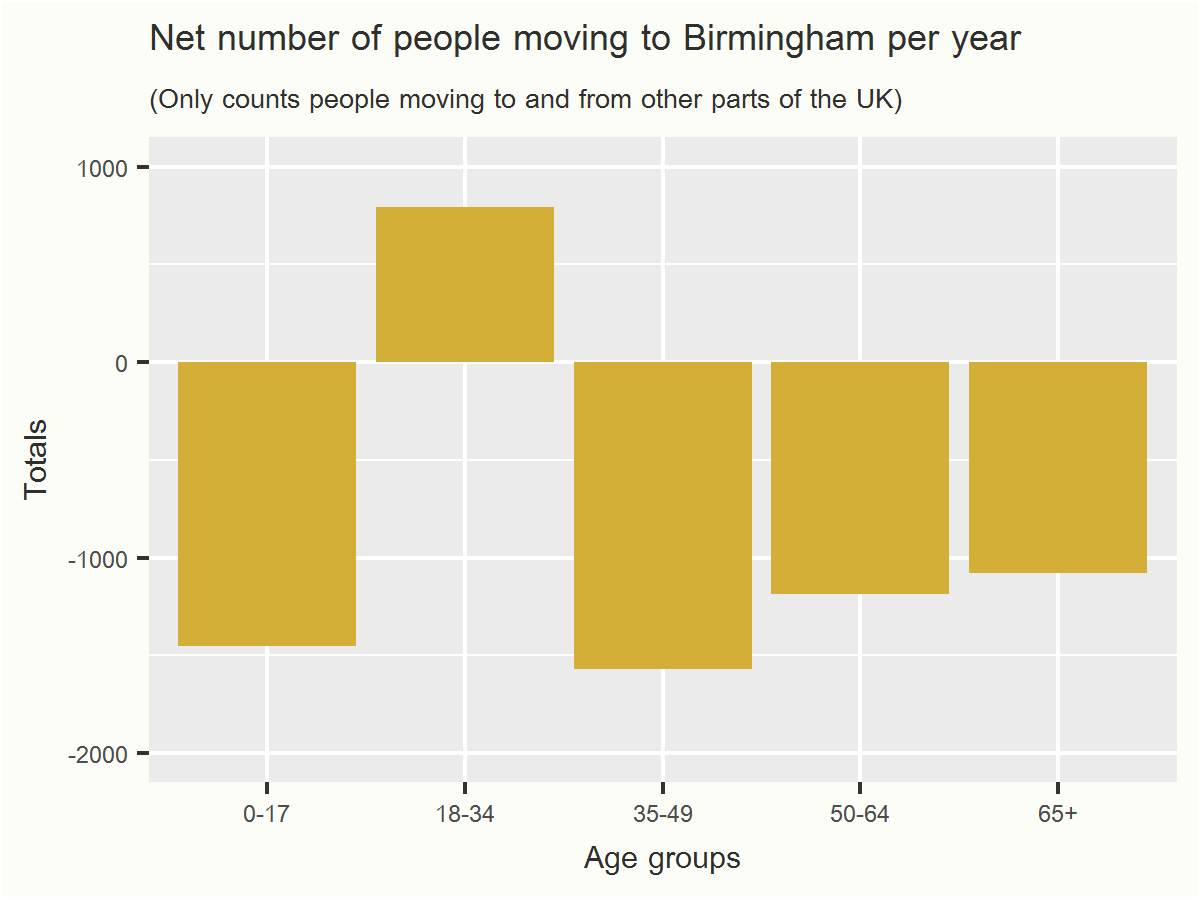
Let’s take Birmingham as an example
#isolate Birmingham
birmingham_groups <- age_groups_totals[age_groups_totals$LA == "E08000025", ]

#plot chart
birmingham_groups <- age_groups_totals[age_groups_totals$LA == "E08000025", ]
birmingham_plot <- ggplot(birmingham_groups, aes(x = groups, y = sum)) + geom_bar(stat="identity", fill = "#D4AF37") + scale_x_discrete(labels = labels) + labs(title = "Net number of people moving to Birmingham per year", subtitle = "(Only counts people moving to and from other parts of the UK)", x = "Age groups", y = "Totals") + theme(plot.background = element_rect(fill = "#fdfdf8"), text=element_text(family="Browallia New", color = "#2f2f2d"))
birmingham_plot <- birmingham_plot + expand_limits(y = c(-2000, 1000))

ggsave("birminghamGGSave.png",birmingham_plot, width = 4, height = 3)
I discovered ggsave() thanks to this post from Max Woolf. It really simplifies the plotting process. Previously I was endlessly formatting the plots and then using the snipping tool to take screenshots of them.
This accomplishes the same goal in much less code, automatically printing a chart as a PNG in your working directory and doing all the resizing for you.

We can see that for Birmingham, everyone is leaving except young people, who are arriving.
But if you look at it by year you can see that it looks like it’s just students coming to Birmingham. Once people go past graduation age they begin to depart:

The overall pattern for different age groups is broadly similar for many other cities. Young people (students) arriving and everyone else leaving:


For rural areas, it’s the reverse. Families and older people are moving there while young people are leaving, presumably in search of jobs and excitement elsewhere. Here is the data for rural Shropshire:

And for rural County Durham:

And for rural County Durham:

Students appear to form the bulk of internal migration within Britain.
The ONS recognises this, so much so that they publish data on term-time and out-of-term population.
But it does seem that families and older people are leaving Britain’s major cities – and, importantly, people in their late 20s.
Rural areas on the other hand have mostly the opposite challenge – a large influx of people moving in while the young move out.