In the first post we completed a hexagonal map showing internal migration at a glance around England and Wales in 2015/16.

This map is very good for an overview of what’s going on around the country – is your area getting more people from or losing people to other parts of Britain?
But it doesn’t show where these people are coming from or going to for any particular area. If people are leaving London (many are), then where are they going to?
That is the focus of this post.
Here’s the code from part 1 to bring you up to speed, using this data:
pt1 <- read.csv("Detailed_Estimates_2016_Dataset_1.csv")
pt2 <- read.csv("Detailed_Estimates_2016_Dataset_2.csv")

data <- rbind(pt1, pt2)

library(tidyr)
library(dplyr)

first <- data %>%
 group_by(OutLA, InLA) %>%
 summarise (sum = sum(Moves))

LA_totals_in <- data %>%
 group_by(InLA) %>%
 summarise (sum = sum(Moves))

LA_totals_out <- data %>%
 group_by(OutLA) %>%
 summarise (sum = sum(Moves))

LA_totals <- merge(LA_totals_in, LA_totals_out, by.x = "InLA", by.y = "OutLA")
LA_totals$net <- LA_totals$sum.x - LA_totals$sum.y

#mapping

library(rgdal)
library(sp)
library(rgeos)

hex <- readOGR(".","GB_Hex_Cartogram_LAs")

p <- shapefile("C:/Users/robgrant/Documents/R/internal_migration/June 2017 data/GB_Hex_Cartogram_LAs.shp")

#add colours
LA_totals$color <- NA

color <- function (a, b) {

 if (a >= 0) {
 b = "#0000FF"
 } else {
 b = "#ff8000"
 }
}

LA_totals$color <- mapply(FUN = color, a = LA_totals$net, b = LA_totals$color)

m <- merge(hex, LA_totals, by.x = "LAD12CD", by.y = "InLA")
plot(m, col = m$color, lwd = 1, main = "Internal migration in England and Wales, year to June 2016",
sub = "Blue = net gain\nOrange = net loss")
We are going to return to our first data frame. Here is another look at what that looks like:
> str(first)
$ OutLA: Factor w/ 350 levels "E06000001","E06000002",..: 1 1 1 1 1 1 1 1 1 1 ...
$ InLA : Factor w/ 350 levels "E06000001","E06000002",..: 2 3 4 5 6 7 8 9 10 11 ...
$ sum  : num  133.03 63.25 322.02 35.46 1.22 ...
Currently the departure local authority and the arrival local authority are in different columns. We’re going to create two new data frames grouping those local authorities together.
The first one will be the departure local authority first and the second will show the arrival first.
OutIn <- data.frame(paste(first$OutLA, first$InLA),first$sum)
InOut <- data.frame(paste(first$InLA, first$OutLA),first$sum)

#rename columns
colnames(OutIn) <- c("pair","sum")
colnames(InOut) <- c("pair","sum")
Let’s take a look at the first line of OutIn and InOut:
> OutIn[1,]
 pair sum
1 E06000001 E06000002 133.0297
This shows that an estimated 133 people moved from (out of) E06000001 (Hartlepool) to E06000002 (Middlesbrough).
If we look for this same pair again from InOut (it’s in row 198), here’s what we find:
> InOut[198,]
 pair sum
198 E06000001 E06000002 122.2908
This shows that an estimated 122 people moved to (in) E06000001 (Hartlepool) from E06000002 (Middlesbrough).
We now have the information we need to get a net figure for Hartlepool to/from Middlesbrough. Just like before, we’ll merge the two data frames using the pair as the common key:
net <- merge(OutIn, InOut, by = "pair", all = TRUE)
The beauty of this method is that it gives a net figure for both to and from Hartlepool and Middlesbrough. One will be the inverse of the other:


Note the all = TRUE argument. This tells R to select all the values in both columns even if one of them has a null value.
We need this because there may be cases where someone moved from one place to the other but no one moved back the other way. Without all = TRUE these won’t be picked up.
In fact, it took me a while to realise why my numbers weren’t quite adding up, and this turned out to be why.
Replacing NAs with zeroes
This all argument includes the NAs but only as NAs. Ideally we want them to be zeroes so we can add and subtract them.
Replacing NAs with zeroes isn’t as easy as it should be. Thanks to krishan404 on Stack Exchange for figuring out how to do it.
We create a formula called na.zero:
na.zero <- function (x) {
 x[is.na(x)] <- 0
 return(x)
}
Then we apply it using mapply to our two columns of values:
net$sum.x <- mapply(FUN = na.zero, x = net$sum.x)
net$sum.y <- mapply(FUN = na.zero, x = net$sum.y)
Then and only then do we create a net value, and remove NAs on that too:
net$net <- net$sum.y - net$sum.x
net$net <- mapply(FUN = na.zero, x = net$net)
Now all we need to do is separate out our pairs back into two columns again. The easy way to do this is to use separate from the tidyr package:
library(dplyr)
library(tidyr)

from_to <- net %>%
#separate using the space (sep)
separate(pair, into = c("from", "to"), sep = " ")
 > str(from_to)'data.frame': 92156 obs. of  5 variables:
$ from : chr  "E06000001" "E06000001" "E06000001" "E06000001" ...
$ to   : chr  "E06000002" "E06000003" "E06000004" "E06000005" ...
$ sum.x: num  133.03 63.25 322.02 35.46 1.22 ...
$ sum.y: num  122.29 78.29 325.75 22.56 4.82 ...
$ net  : num  10.74 -15.04 -3.73 12.9 -3.6 ...
It’s worth just checking whether the numbers add up. The easiest way to do this is to select a random local authority and sum the net figure. If it equals our figure from LA_totals we know we’re doing it right.
> oldham <- from_to[from_to$from == "E08000004", ]
> sum(oldham$net)
[1] -755.9955
Happily this checks out with Oldham’s figure from LA_totals. So let’s move on.
Using this data we can now plot whether net migration is positive or negative for any local authority we like.
The simplest way to do this is to return to our LA_totals and filter it for a local authority.
Let’s say Manchester. For more detail on this section, see the last post.
library(rgdal)
library(sp)
library(rgeos)

#note we are reversing the colours
color <- function (a, b) {

 if (a >= 0) {
 b = "#ff8000"
 } else {
 b = "#0000FF"
 }
}

manchesterIn <- from_to[from_to$to == "E08000003", ]
manchesterIn$color <- NA
manchesterIn$color <- mapply(FUN = color, a = manchesterIn$net, b = manchesterIn$color)
The only thing to add is a different colour to highlight Manchester itself. It’s not in the data because you can’t travel from Manchester to Manchester, so we’ll have to add it ourselves with a different colour:
manchesterIn[350,] <- c("E08000003","E08000003", 0,0,0,"#7f0000")
b <- merge(hex, manchesterIn, by.x = "LAD12CD", by.y = "from")
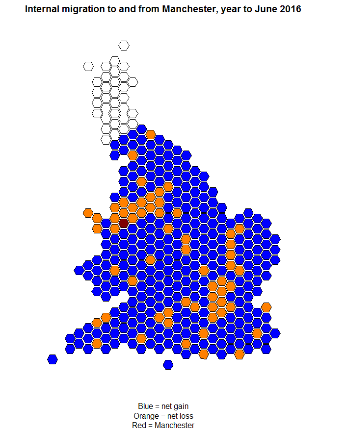
plot(b, col = b$color, lwd = 1, main = "Internal migration to and from Manchester, year to June 2016",
sub = "Blue = net gain\nOrange = net loss\nRed = Manchester")

Analysis
Manchester has a net gain from most places in England and Wales. As we’ll see in the next post, many of these people will be students.
However it’s losing people to the surrounding area – notice that huge swathe of orange showing net losses in the North West. These will likely be older people moving out of the city.
Lastly Manchester seems to be losing people to bits of London and East Anglia surrounding Cambridge.
Are bright graduates sensing opportunities in the South instead?
Let’s try Cornwall this time:

Like Manchester, Cornwall also has a net gain from a swathe of Middle England.
However, Cornwall is losing people to Plymouth, Bristol and Manchester among other places – young people moving in search of jobs?
Conclusion
We can sub in and out any local authority we like with this data and it shows at a glance what’s going on in your area.
Ideally I could publish it as an interactive, maybe using Shiny, but I’m not there yet.
In part III, we will go into more detail and look at the ages of the people coming and going.
Want to know what’s going on in your area? Follow the code or tweet me and I’ll do you a graphic.