Andy Murray was crowned as the world number one in men’s tennis for the first time today.
The two-time Wimbledon champion has long been out on his own as Britain’s best male tennis player and now he’s managed to overhaul Novak Djokovic at the summit of the game.
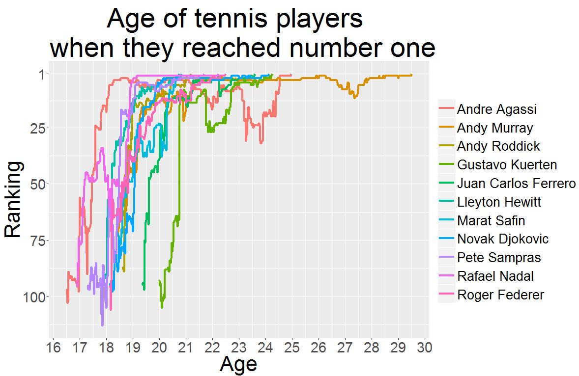
It took Andy Murray a lot longer than usual to get to #1
Murray is the 11th man to get to number one since the year 2000. He is 29.
That’s five years older than the next oldest players to get to the top this century – Andre Agassi, Novak Djokovic and Gustavo Kuerten, all aged 24.
The youngest were Lleyton Hewitt and Marat Safin, who both reached the top aged just 20 years old.
Let’s take a look at the data:
I copied this data from ATP World Tour, starting from when each player broke into the top 100 for the first time and ending with their first weeks at number one.
I also inputted their date of birth in my CSV file.
> tennis <- read.csv("tennis2.csv")
> str(tennis)
'data.frame': 2646 obs. of 4 variables:
 $ Player : Factor w/ 11 levels "Andre Agassi",..: 1 1 1 1 1 1 1 1 1 1 ...
 $ Date : Factor w/ 1358 levels "01/01/1990","01/01/2007",..: 403 92 1179 869 541 209 1176 865 537 205 ...
 $ Ranking: int 1 2 2 2 2 2 2 2 2 2 ...
 $ DOB : Factor w/ 11 levels "03/06/1986","08/08/1981",..: 10 10 10 10 10 10 10 10 10 10 ...
In the last post we were introduced to as.Date, which converts the various ways you can write a date into a standardised R format.
We’ll need that for ‘Date’ and ‘DOB’ here.
> tennis$Date <- as.Date(tennis$Date, format = "%d/%m/%Y")
> tennis$DOB <- as.Date(tennis$DOB, format = "%d/%m/%Y")
> str(tennis)
'data.frame': 2646 obs. of 4 variables:
 $ Player : Factor w/ 11 levels "Andre Agassi",..: 1 1 1 1 1 1 1 1 1 1 ...
 $ Date : Date, format: "1995-04-10" "1995-04-03" ...
 $ Ranking: int 1 2 2 2 2 2 2 2 2 2 ...
 $ DOB : Date, format: "1970-04-29" "1970-04-29" ...
Using the two dates, we can calculate the player’s age week to week
We want to know how old each player was along their journey to the top.
Dates can be added and subtracted in R, so it’s simple: we’ll just subtract the date of birth from the date:
> tennis$Age.at.ranking <- tennis$Date - tennis$DOB
> str(tennis)
'data.frame': 2646 obs. of 5 variables:
 $ Player : Factor w/ 11 levels "Andre Agassi",..: 1 1 1 1 1 1 1 1 1 1 ...
 $ Date : Date, format: "1995-04-10" "1995-04-03" ...
 $ Ranking : int 1 2 2 2 2 2 2 2 2 2 ...
 $ DOB : Date, format: "1970-04-29" "1970-04-29" ...
 $ Age.at.ranking:Class 'difftime' atomic [1:2646] 9112 9105 9098 9091 9084 ...
 .. ..- attr(*, "units")= chr "days"
OK, we have our age at ranking now, which will be the player’s age in days each week.
Obviously we measure age in years, so let’s convert them to years to help ourselves out.
We can find the years by dividing by 365.
However, this will rarely be a round number. We always need to round down because someone who is 24.8 years old (i.e. roughly 24 years 10 months old) is still a 24-year-old.
To round down we need the floor function.
tennis$year.at.ranking <- as.numeric(floor(tennis$Age.at.ranking/365))
Originally I had all the rankings data from the players – i.e. from their breakthrough in the top 100 through to their retirement or the present day. I had a go at using aggregate to get the minimum age at which they reached number one.
In the end the graph became too messy so I deleted the additional data.
Even so, this code using the data.table package found the minimum years:
#number one
number1 <- tennis[tennis$Ranking == 1, ]
number1

library(data.table)
DT <- data.table(number1)
DT[,list(year.at.ranking = min(year.at.ranking)), by=Player]
This is isolating the number one ranking (remember that in the original data players like Federer were #1 for weeks and weeks) and calculating a list of each player by their minimum age at number one.
It’s not really necessary after removing the surplus data, but it works.
This is the result:
> library(data.table)
> DT <- data.table(number1)
> DT[,list(year.at.ranking = min(year.at.ranking)), by=Player]
 Player year.at.ranking
 1: Andre Agassi 24
 2: Andy Murray 29
 3: Andy Roddick 21
 4: Gustavo Kuerten 24
 5: Juan Carlos Ferrero 23
 6: Lleyton Hewitt 20
 7: Marat Safin 20
 8: Novak Djokovic 24
 9: Pete Sampras 21
10: Rafael Nadal 22
11: Roger Federer 22
It’s in alphabetical order, but it’s not hard to see how much older Murray is than the rest of the number one club.
Let’s plot the graph:
p <- ggplot(tennis, aes(x = Age.at.ranking,
y = Ranking, color = Player, group = Player)) + geom_line(size = 1.7)
p <- p + ggtitle("Age of tennis players \n when they reached number one")
p <- p + labs(x = "Age", y = "Ranking")
p <- p + theme(axis.title=element_text(size=32),
 axis.text=element_text(size=22),
 plot.title=element_text(size=42),
 legend.key.size = unit(1, "cm"),
 legend.text = element_text(size = 20),
 legend.title = element_blank())

p

Three things to notice:
- We’d rather it were the other way up. Number one is the pinnacle of success, so it should be at the top
- The age is in days
- The scale on the y axis counts down from 0 to 90. We want it from 100 to 1.
Having the age in days is no good because no one measures age in days. Do you know how many days old you are? Probably not, and you probably don’t want to either.
We can fix two of these three problems using breaks and labels.
We’ve come across them before. The difference is as follows:
- The breaks are the values you want to represent on the axes
- The labels are optional new names for the break values
So you can select the values you want to show using breaks and (optionally) relabel them using labels.
For the y axis, we want 100 to 1 (with 75, 50 and 25 to help). There’s no need to relabel them:
p <- p + scale_y_reverse(breaks = c(100,75,50,25,1))
For the x axis, we do need some labels. This is a nifty way to do it:
#create ages
labelss <- c(16:30)
breakss <- labelss*365
Here we are saying: ‘Create some labels from 16 to 30. The values they represent are the number times by 365’.
In other words, 16 * 365 is the age in days, but 16 is the age in years we will display. Repeat up until 30.
p <- ggplot(tennis, aes(x = Age.at.ranking,
y = Ranking, color = Player, group = Player)) + geom_line(size = 1.7)
p <- p + ggtitle("Age of tennis players \n when they reached number one")
p <- p + labs(x = "Age", y = "Ranking")

#reverse y axis and change scale from 100 to 1
p <- p + scale_y_reverse(breaks = c(100,75,50,25,1))

#change x axis to reflect years
p <- p + scale_x_continuous(breaks = breakss, labels = labelss)
p <- p + theme(axis.title=element_text(size=32),
 axis.text=element_text(size=22),
 plot.title=element_text(size=42),
 legend.key.size = unit(1, "cm"),
 legend.text = element_text(size = 20),
 legend.title = element_blank())

p

Concluding thoughts:
First of all, hats off to Andy Murray. The man’s dedication and resilience are phenomenal and he deserves to be called the best in the game right now.
Secondly, the graph looked messy if I allowed the data to carry on past the first week at number one. I cut the data in Open Office. Is there a way I could have done it in R?
Finally, the graph is a bit crowded. But the point of it is not to show exactly when each player got to number one, instead to show how much longer it took Murray.