The last post came in for some criticism on /r/rstats, in particular from /u/fang_xianfu, who argued it merely showed that London has more people than the rest of the country.
Even without adjusting for population, I thought my point was clear enough. Although to be fair, my analytics show many of my readers are from outside the UK who understandably may not have a thorough grounding in UK human geography.
As it happens, this is a good opportunity to use the merge function to bring in population data to compare per capita. So thanks for bringing it up!
We’ll get the data into a similar format as before, using the gather function. But instead of putting all years in, this time we’ll just take the year 2015/16:
data <- read.csv("buses.csv")

str(data)

options(scipen=999)

library(tidyr)

#create data with just 2015/16
new_data <- gather(data, year, journeys, X2015.16)

#remove superfluous years
data2015.16 <- subset(new_data,
select = c(LA.Code, Local.Authority, year, journeys))
Now we need our population data:
The latest population data comes from the mid-year estimates from the Office for National Statistics.
You can see from the cleaned data that it has the codes that we have in our data frame already. This means we’ll be able to join two data frames together around this column.
We can do that using the merge function:
The basic syntax of merge is:
 merge([data frame1], [data frame2],
by.x = "[common_col_in_first_df]",
by.y = "[common_col_in_second_df]")
We are saying below: ‘Join “data2015.16” and “pop” into a new data frame called “merged”, using the columns “LA.Code” and “CODE.”‘
#bring in population data
pop <- read.csv("pop.csv")

#merge the data with my existing data frame
merged <- merge(data2015.16, pop,
by.x = "LA.Code", by.y = "CODE")
Calling str() on merged at this point shows our ages are in there:
> str(merged)
'data.frame': 95 obs. of 6 variables:
 $ LA.Code : Factor w/ 97 levels "E06000001","E06000002",..: 1 2 3 4 5 6 7 8 9 10 ...
 $ Local.Authority: Factor w/ 97 levels "Bath and North East Somerset",..: 31 45 64 76 16 29 85 3 4 36 ...
 $ year : chr "X2015.16" "X2015.16" "X2015.16" "X2015.16" ...
 $ journeys : num 4.7 8.3 3.9 8.5 6.2 5.6 6.9 4 10.8 23 ...
 $ NAME : Factor w/ 429 levels "Aberdeen City",..: 164 221 278 346 89 154 388 25 26 189 ...
 $ ALL.AGES : int 92493 139509 135275 194803 105389 126528 207695 146846 139578 258995 ...
Now let’s work out per capita:
To get this, we’ll divide the number of journeys by population. As the journeys are in millions, we’ll need to multiply that figure by 1,000,000 first.
merged$per.capita <- (merged$journeys*1000000)/merged$ALL.AGES
Let’s isolate the regions again:
> regions <- grep("E12",merged$LA.Code)
> regions <- merged[regions, ]
> regions
 LA.Code Local.Authority year journeys
87 E12000001 North East X2015.16 180.1
88 E12000002 North West X2015.16 433.8
89 E12000003 Yorkshire and The Humber X2015.16 329.7
90 E12000004 East Midlands X2015.16 197.7
91 E12000005 West Midlands X2015.16 343.6
92 E12000006 East of England X2015.16 181.6
93 E12000007 London X2015.16 2292.6
94 E12000008 South East X2015.16 353.1
95 E12000009 South West X2015.16 217.3
 NAME ALL.AGES per.capita
87 NORTH EAST 2624621 68.61943
88 NORTH WEST 7173835 60.46975
89 YORKSHIRE AND THE HUMBER 5390576 61.16230
90 EAST MIDLANDS 4677038 42.27034
91 WEST MIDLANDS 5751000 59.74613
92 EAST 6076451 29.88587
93 LONDON 8673713 264.31587
94 SOUTH EAST 8947913 39.46172
95 SOUTH WEST 5471180 39.71721
Like we did when looking at house prices in Leeds, we’ll order the data per capita, smallest to largest:
regions$Local.Authority <- factor
(regions$Local.Authority,
levels = regions$Local.Authority
[order(regions$per.capita)])
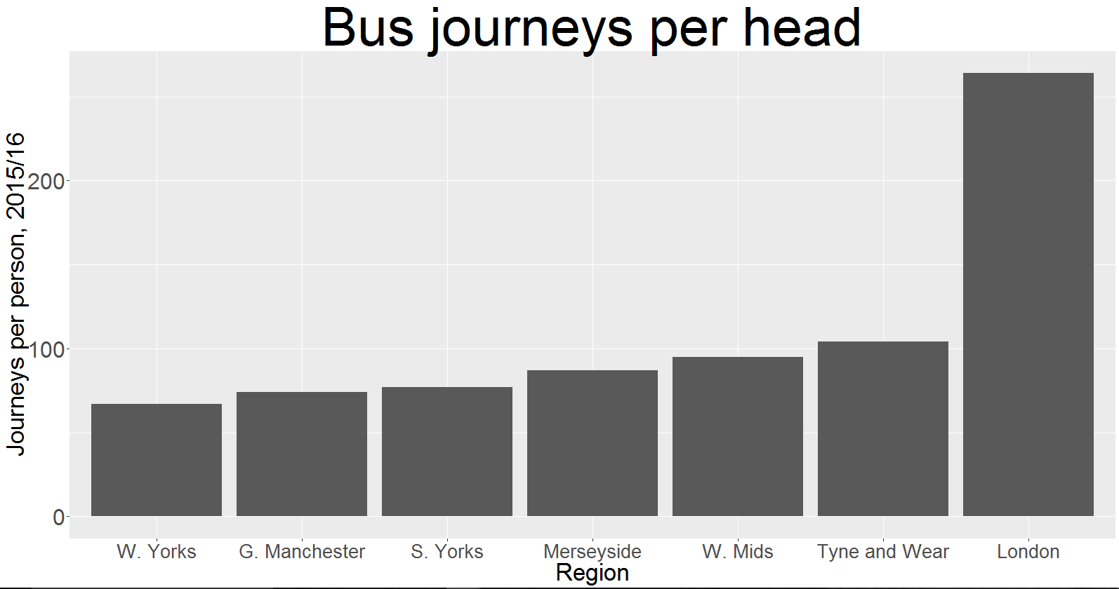
OK, let’s plot a bar graph to see whether London still stands out:
p <- ggplot(regions, aes(x = Local.Authority,
y = per.capita))
+ geom_bar(stat="identity")
+ ggtitle("Bus journeys per head")
+ labs(x = "Region",y = "Journeys per person,
2015/16")

#reduce label size
labelss <- c("East","SE","SW","East Mids",
"West Mids","NW","Yorkshire & Humber","NE","London")

#formatting
p + scale_x_discrete(labels = labelss)
+ theme(plot.title = element_text(size = 58),
 axis.text.y = element_text(size = 24),
 axis.text.x = element_text(size = 20),
 axis.title = element_text(size = 26))

Analysis:
Adjusting for population is in fact a better way to show the point from my previous post.
I can’t say why Londoners take the bus more often than the rest of the country.
To be sure, the population density plays a large part. But the West Midlands and the South East, for example, are largely densely populated areas with a fraction of the bus use of the capital.
To compare like with like as best as possible, you could refer back to the ‘per ITA’ tab on the original spreadsheet. You’ll see that London still has more than twice as many journeys per head as any other densely populated major urban area in England.

I could have gone with urban areas from the beginning, but it needed some tinkering to get it in the correct format. For the purposes of merge, it was easier to use regions. But the points are still valid: buses shouldn’t just serve big cities. And even the cities they do serve are nowhere close to London.
If it is true that buses are more available in London, then I’m hopeful that devolution will see the rest of the country catch up with the capital. They are after all, a useful way of getting around.
