In the last post we discussed annotations on line plots.
In this post, we are going to take it a step further and look at block annotations.
They look like this:

We’re going to use these rectangular annotations on the UK Office for National Statistics (ONS) unemployment data.
This dataset goes back to 1971 and is updated monthly. The data has yearly, quarterly and monthly data. I deleted the yearly and quarterly data to focus on the monthly data, for reasons that will become clearer later.

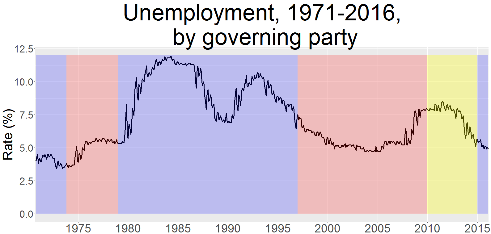
We can see from the chart that unemployment in the UK has been as high as around 12 per cent in the 1980s but rarely drops below five per cent.
The chart doesn’t show which political parties were in charge during this time.
Rectangular annotations can help us out
data <- read.csv("unemployment.csv")
str(data)
'data.frame': 545 obs. of 2 variables:
 $ Date: Factor w/ 545 levels "1971 Apr","1971 Aug",..: 4 7 1 8 6 5 2 11 10 9 ...
 $ Rate: num 3.8 3.9 4 4.1 4.1 4.2 4.2 4.3 4.4 4.4 ...
Plotting a geom_line with no formatting looks like this:
#plot
p <- ggplot(data, aes(x = Date,
 y = Rate,
 group = 1)) + geom_line(size = 1.4)

We run into the same problem as last time, which is the overlapping labels on the x axis. Unlike last time though, the x axis labels are character vectors, e.g. “1991 Feb”.
We can skip round this problem using scale_x_discrete, breaks and labels.
The breaks are the vectors you want to show in your plot. The labels are how you label the breaks.
Our data looks like this:
 Date Rate
1 1971 Feb 3.8
2 1971 Mar 3.9
3 1971 Apr 4.0
4 1971 May 4.1
5 1971 Jun 4.1
6 1971 Jul 4.2
To simplify things, we’ll take every fifth January and call it by its year, so January 1990 becomes 1990 on the plot.
I made two different vectors for the breaks and labels to make it more manageable:
#create breaks and labels
breaks_plot <- c("1975 Jan","1980 Jan","1985 Jan",
"1990 Jan","1995 Jan","2000 Jan",
"2005 Jan","2010 Jan","2015 Jan")
labels_plot <- c("1975","1980","1985",
"1990","1995","2000",
"2005","2010","2015")
Each label corresponds to the break.
p + scale_x_discrete(breaks = breaks_plot,
 labels = labels_plot)
 That’s looking much cleaner – see how the years are now at five year intervals.
Let’s take another look at our data:
 Date Rate
1 1971 Feb 3.8
2 1971 Mar 3.9
3 1971 Apr 4.0
4 1971 May 4.1
5 1971 Jun 4.1
6 1971 Jul 4.2
7 1971 Aug 4.2
8 1971 Sep 4.3
9 1971 Oct 4.4
10 1971 Nov 4.4
We can see that R numbers each row of data.
Ted Heath’s Conservative government was in power when the data begins in 1971. Labour’s Harold Wilson took over in March 1974, the 38th month of our dataset.
So if we set the rectangle to begin in month one and end in month 38, it will accurately show the share of the plot taken up by Heath’s government.
+ labs(x = "Year",
 y = "Rate (%)")
+ ggtitle("Unemployment, 1971-2016,\n by governing party")

#first rectangle
+ annotate("rect", xmin = 1,
 xmax = 38,
 ymin = 0,
 ymax = 12,
 alpha = 0.2,
 fill = "blue")

The xmin and xmax parameters are where we fill in one and 38 for the first and 38th months of our dataset respectively.
> max(data$Rate)
[1] 11.9
Calling max on our data shows that the highest unemployment figure was 11.9 per cent. So we can set ymax to 12 to cover it. Alpha controls the opacity of the rectangle.
All that remains now is to fill in the others:
+ annotate("rect",
 xmin = 38,
 xmax = 100,
 ymin = 0,
 ymax = 12,
 alpha = 0.2,
 fill = "red") + annotate("rect",
 xmin = 100,
 xmax = 316,
 ymin = 0,
 ymax = 12,
 alpha = .2,
 fill = "blue") + annotate("rect",
 xmin = 316,
 xmax = 472,
 ymin = 0,
 ymax = 12,
 alpha = .2,
 fill = "red") + annotate("rect",
 xmin = 472,
 xmax = 532,
 ymin = 0,
 ymax = 12,
 alpha = .3,
 fill = "yellow") + annotate("rect",
 xmin = 532,
 xmax = 545,
 ymin = 0,
 ymax = 12,
 alpha = .2,
 fill = "blue") +theme(plot.title = element_text(size = 55),
 axis.text.y = element_text(size = 24),
 axis.text.x = element_text(size = 28),
 axis.title.y = element_text(size = 32),
 axis.title.x = element_blank())

Analysis
I used red for the Labour Party, blue for the Conservatives and yellow for the Conservative-Liberal Democrat coalition.
We can see that unemployment spiked in the early Thatcher years.
It came down again, only to shoot back up again in 1990.
John Major took over and unluckily for him the world entered recession around that time.
After Black Wednesday in 1992, even though the unemployment rate came down in the early 1990s, the Conservatives were finished.
Labour came in cautioning against a cycle of boom and bust.
They largely succeeded on the unemployment front until the credit crunch hit in 2007, followed by the Great Recession, when it began to climb rapidly.
It then fell significantly during Cameron’s premiership despite warnings austerity would lead to a higher jobless rate – something Fraser Nelson in the Spectator called an ‘economic miracle’.
Unemployment has continued to come down since the Conservatives surprisingly won the 2015 election.
The very latest figures haven’t shown any signs of a surge in layoffs after the June vote to leave the EU.
There we have it.
This post has covered using rectangles as annotations to show the British unemployment rate under different political parties, plus how to use breaks in your axes scaling.